SuperCane - Loyalty Mobile App & UI/UX Design

SuperCane: Making a Loyalty App Feel Like the Brand, Without Redrawing It
🎋 A loyalty app for a Singapore sugarcane drink brand. I was the only designer, from audit to handover.
🎯 Role: UI designer. I owned the audit, scope, design system, every screen and the handover.
🧩 Type: Freelance. Refine an existing app, deliver a real Figma file.
✅ Result: Everything delivered. The client told me they really appreciated the work.
1. The Problem: 7 Screens Became 19 😮
The brief: make the app feel more SuperCane, keep it easy to use. Refine, don't redesign. Then I audited the file.
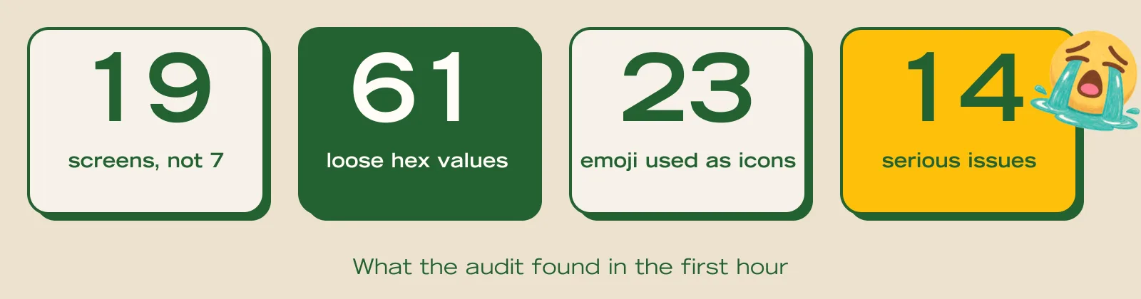
One example: Wallet showed 115 points. Home showed 840. Same user.
2. Decision 1: Show the Real Scope Early 🔍
I could have done 7 screens quietly. I showed the audit instead, with a clear proposal: the named screens get full care, the rest get the system pass. The client saw the true size, and we kept moving.
3. Decision 2: Personality in the Art, Not the Layout 🎨
I rejected new layouts. The budget was small and the brief said refine. My rule instead:
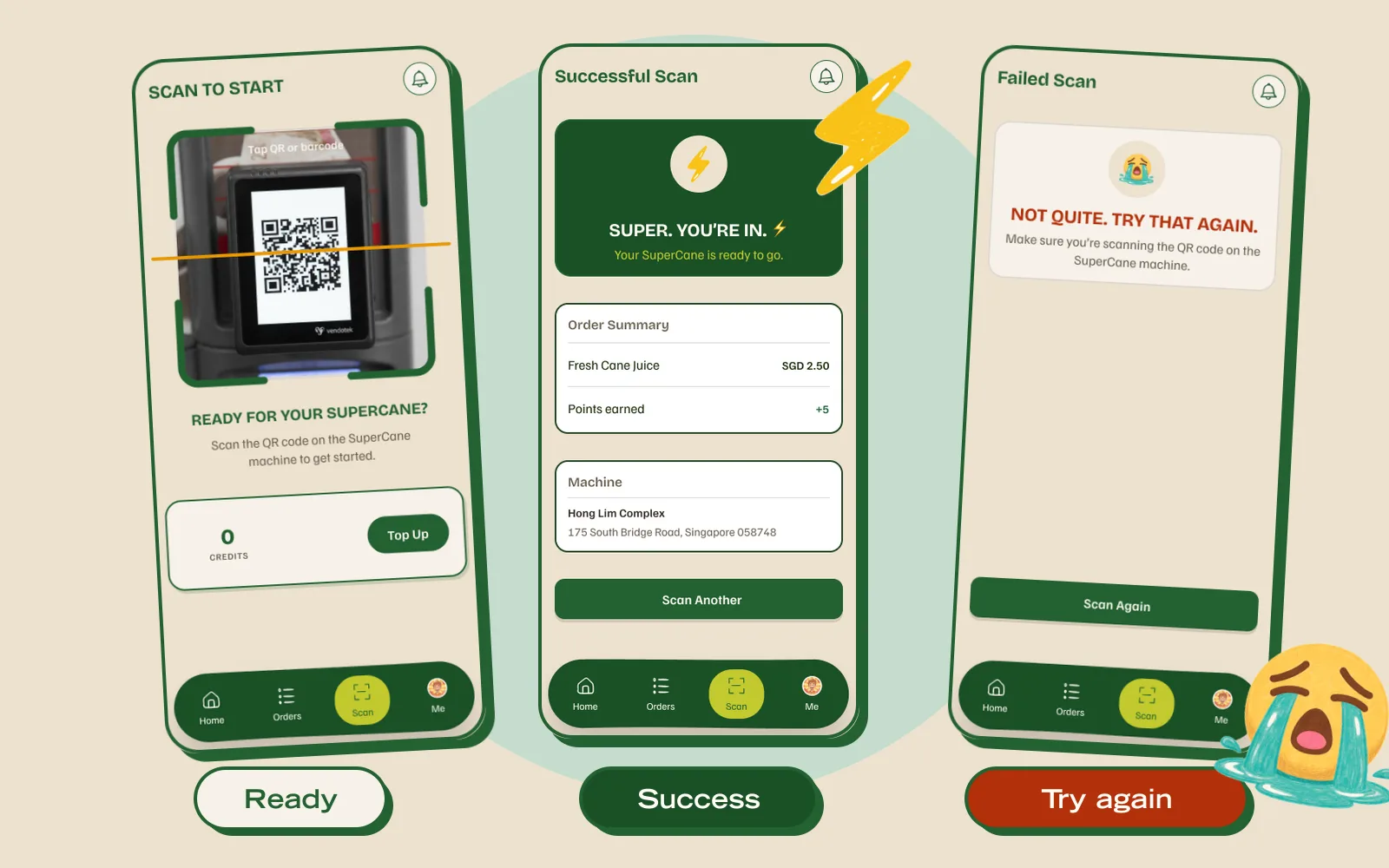
💧 Money screens stay calm. Wallet, Scan, Orders.
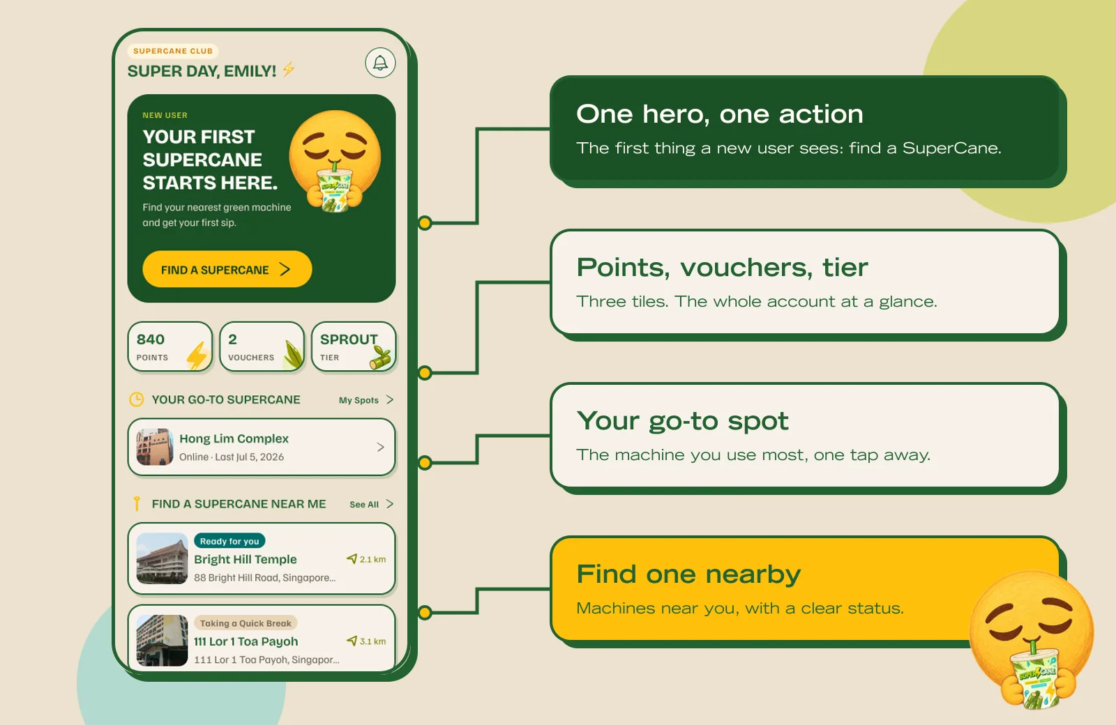
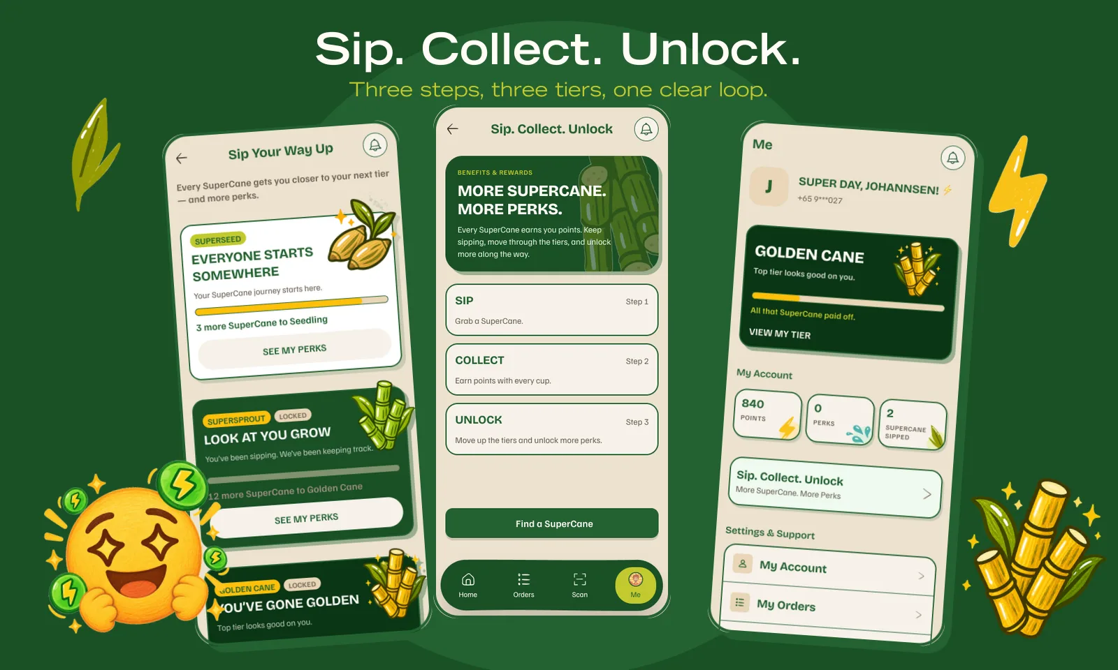
⚡ Reward screens get loud. Home, Tiers, Sip Collect Unlock.
2️⃣ Two motifs per screen, max. So fun never becomes clutter.
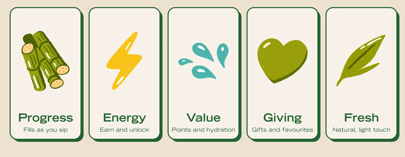
Every motif got a job. Motifs with a job look planned.
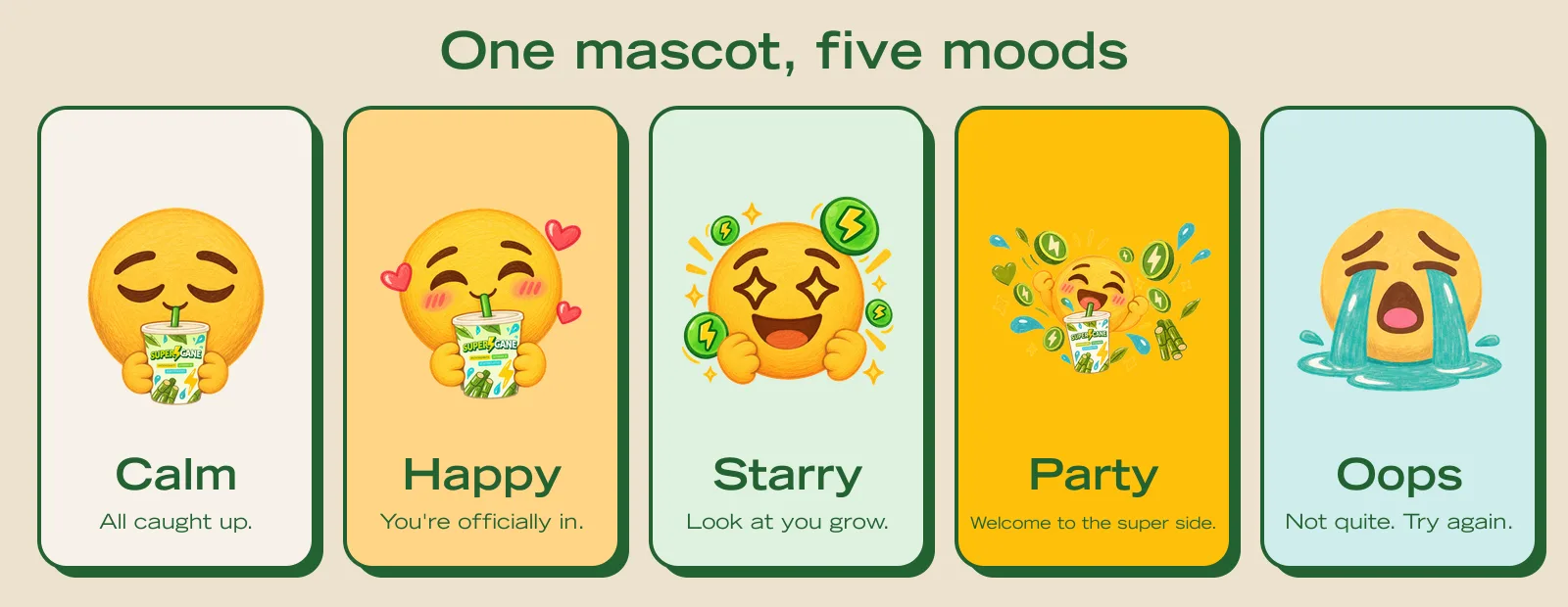
The mascot does the same job for feelings. One face, five moods, each tied to a real moment in the app.
4. Decision 3: Fix the System Once 🧱
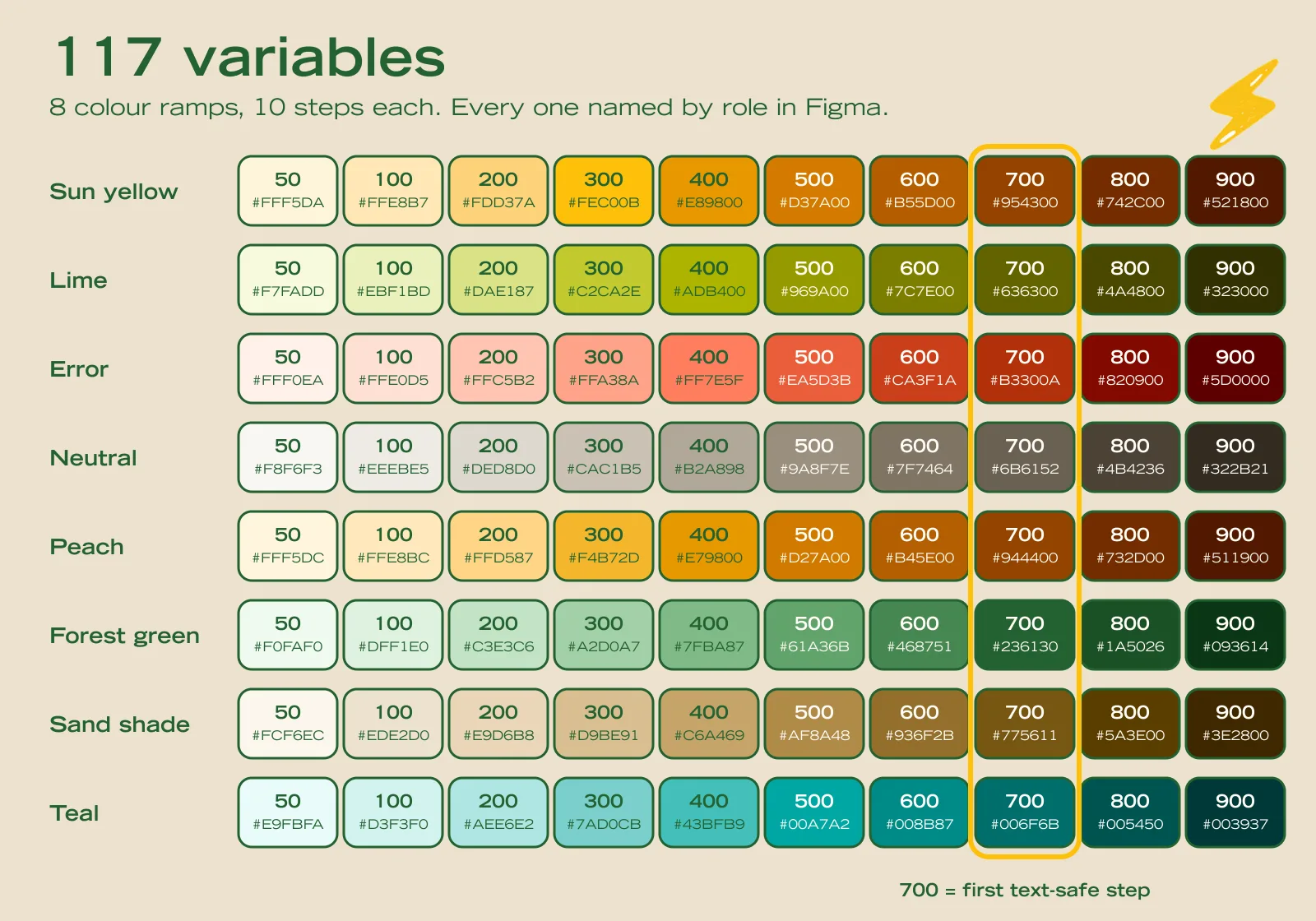
I could not polish every screen by hand. I replaced 61 loose hex values with 117 colour variables, named by role, not by colour.
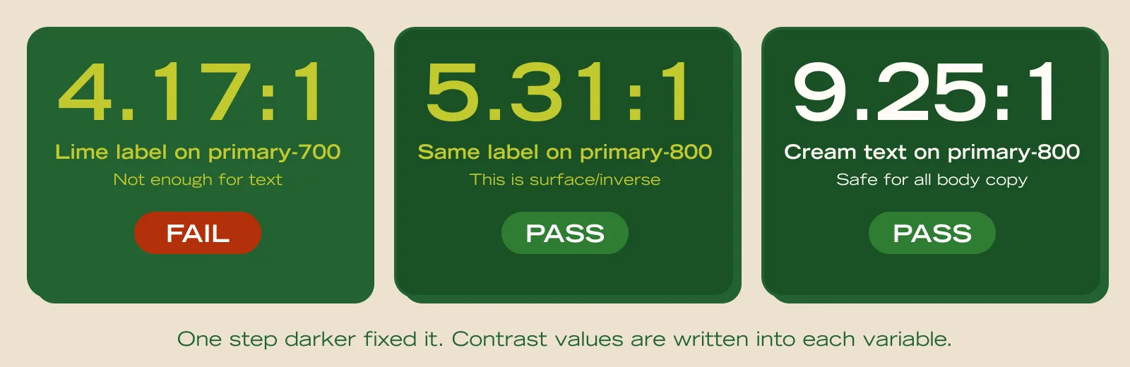
Two rules came from measuring, not taste:
🌲 Dark panels use the deeper green. The lime label failed AA on the mid green and passes on the deeper one.
🏷️ Sticker cards. A 2px border and a hard shadow replaced soft grey shadows. It matches the cups.
Home was the reference screen. Every other screen followed its patterns.
5. Decision 4: Two Kinds of Icons, Never Mixed 🚫
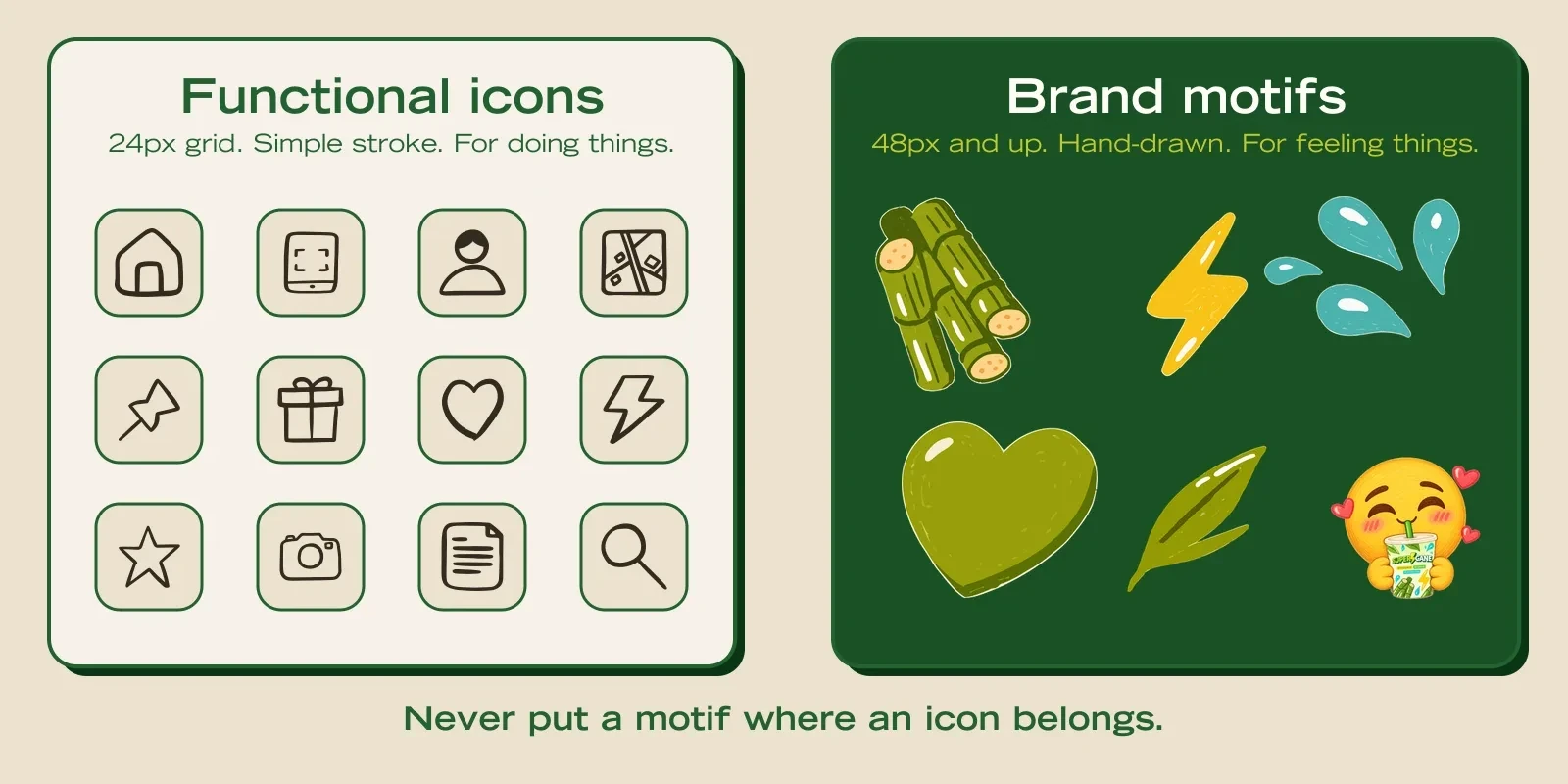
The old file mixed 23 emoji, hand-written icons and illustrations in one list row. It looked unfinished. So I split them:
✏️ Functional icons: simple strokes, 24px, for doing things.
🖍️ Brand motifs: hand-drawn, 48px and up, for feeling things.
6. Decision 5: Break the Brief Once, for the User 📱
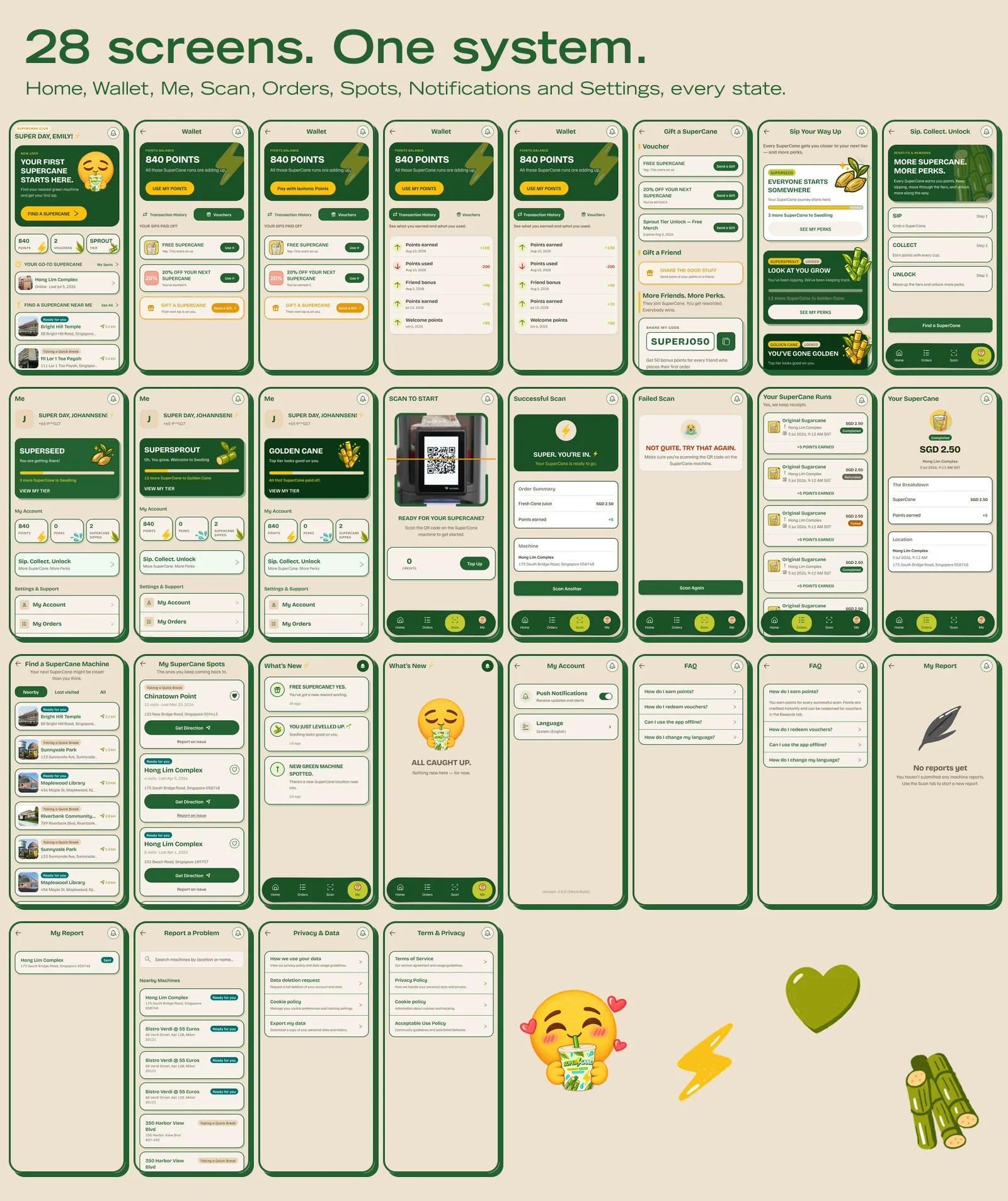
Wallet was one long page of stacked sections. It felt like a website, not an app. I changed it to tabs, so users focus on one part at a time.
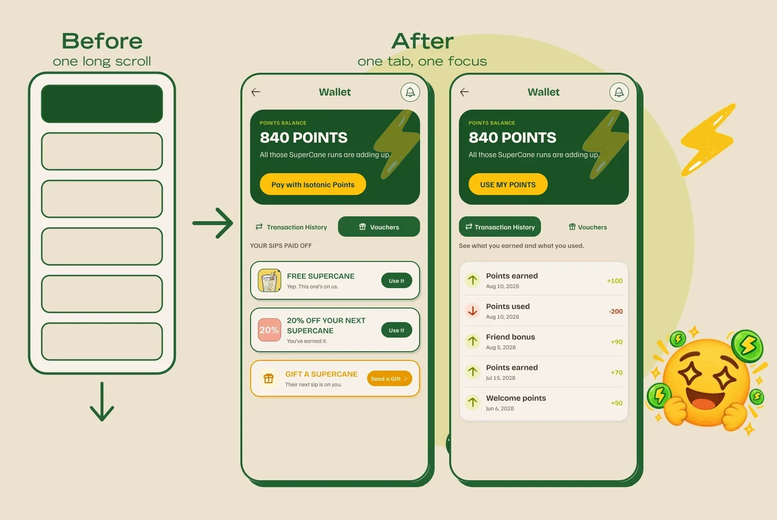
❌ Rejected: keep the scroll. Cheapest, but the problem stays.
❌ Rejected: add more screens. The scope grows.
✅ Chosen: tabs. No new screens, no new navigation pattern.
I told the client what I changed and why. They said they really appreciated the UX improvement.
7. A Small Bug That Mattered: Two Tier Ladders 🪜
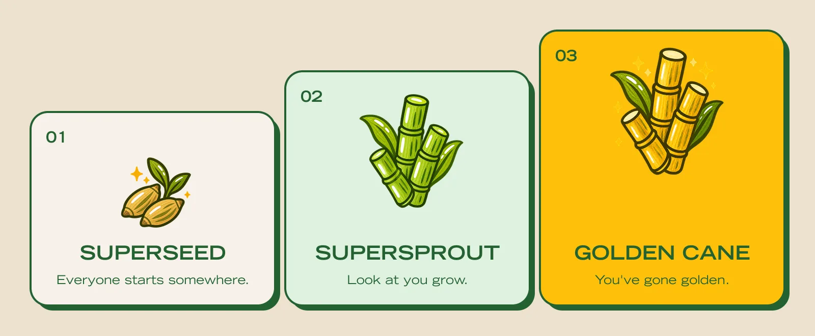
The Tiers screen showed 3 levels. Sip Collect Unlock showed 4, in the opposite order. I kept the 3-level ladder, the one with real artwork, and dropped the fourth level until the client confirms it.
8. Design for the Bad Moments Too 😢
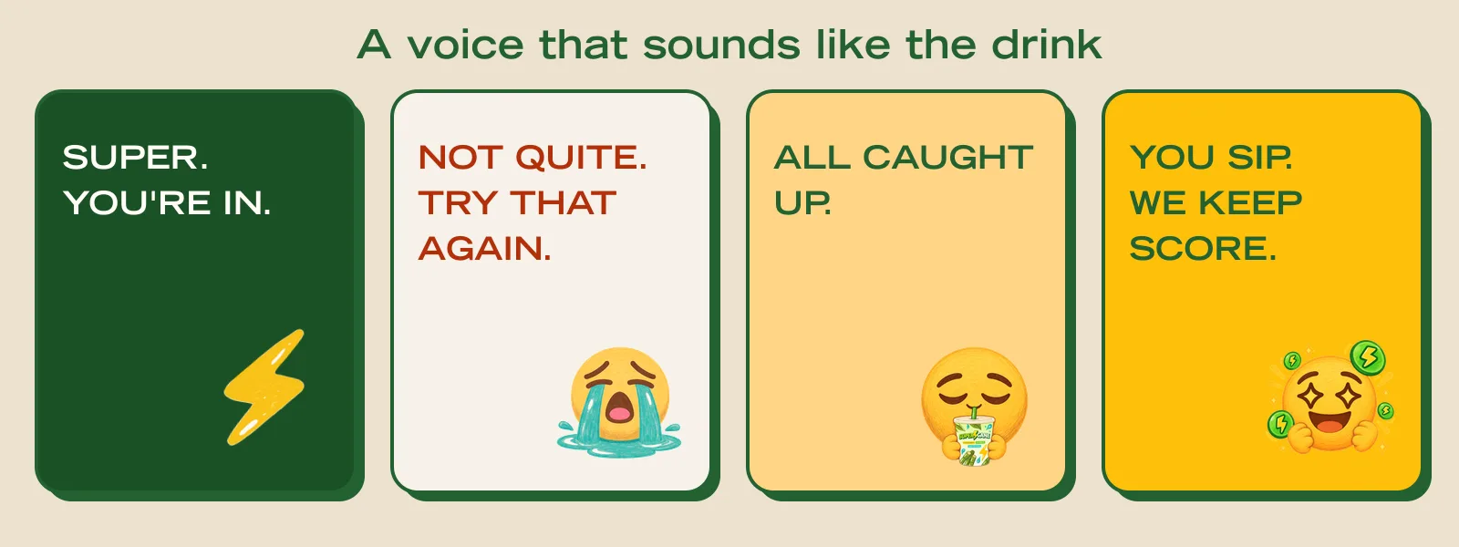
A failed scan is a bad moment. So it got a face, a short line, and one clear way to try again. No red wall of text.
9. What I Delivered 📦
📋 Full audit of 19 screens, with severity and fixes.
🧱 Colour system: 117 variables with contrast values written in, plus a documentation PDF for handover.
📱 28 final screens, every state, with tabs in Wallet.
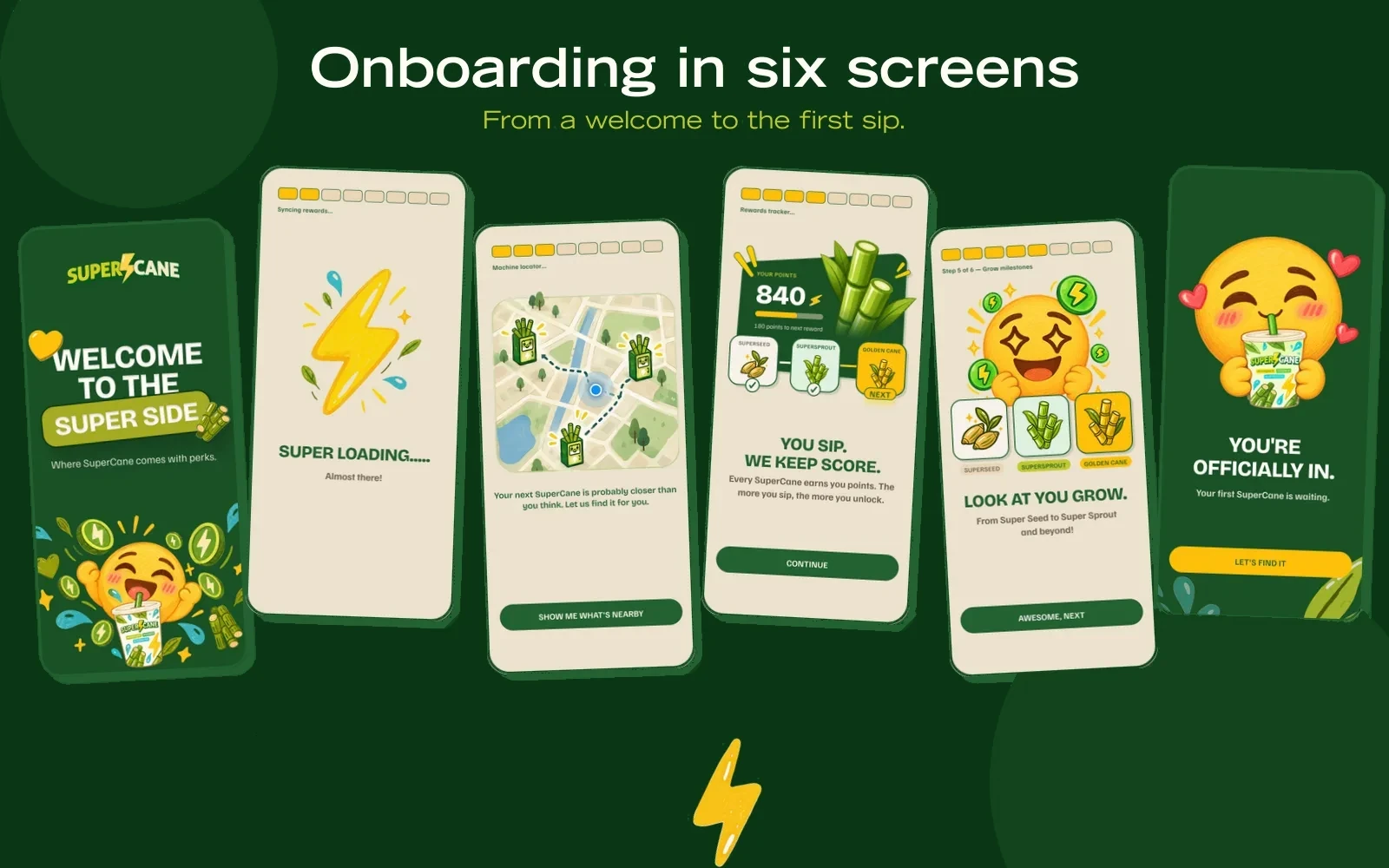
👋 A 6-screen onboarding flow led by the mascot.
🎋 Brand assets in use: motifs, mascot moods and tier artwork, all placed with rules.
10. What I Took From It 💡
I thought the job was to make screens prettier. It was to decide where the brand shows up, and where it stays out of the way.
📏 A rule beats a screen when the budget is small.
🙋 Users beat the brief when the two disagree. Tell the client why.
👀 Next time I will see the full file before I agree on scope.