Lanesra - AI Search Analytics SaaS & UX UI Dashboard Design

Lanesra: Designing an AI Search Analytics Platform
Now live at lanesra.ai. As the contract product designer, I designed the whole tool, from the first competitor study to about 50 screens and an internal admin panel.

1. The Problem: A New Kind of Analytics
Search is moving from blue links to AI answers. Brands can't see whether ChatGPT, Gemini or Perplexity mention or recommend them. Lanesra measures that. Three numbers matter: how often you appear (visibility), where you land inside the answer (position), and how the model frames you (sentiment).
It is a young category with few habits to lean on, a small team and a short timeline. So I started by learning how people already use tools like this.
2. Learning From Competitor Apps
I walked through the live products of 17 competitors, including Profound and Peec, the way a new customer would: sign up, onboard, set up a first project, open the dashboard on day two. I noted where people are asked for too much too early, which screen they come back to, and which numbers they check first.
The overview carries the product. It is the screen people open every day, so everything else hangs off it.
Onboarding should lead somewhere. Peec, the client's own quality bar, shows a preview of the dashboard behind its sign up and onboarding forms. I kept that idea.
The category looks identical. 13 of 17 products used green or blue, so we chose a monochrome look instead.
3. Information Architecture
The sidebar is the map of the product. I grouped every page by the question it answers, so people don't have to learn our words first. Overview is the home screen, and the same filters (date, prompt set, tags, models, topics) follow you from page to page.

4. Platform Structure
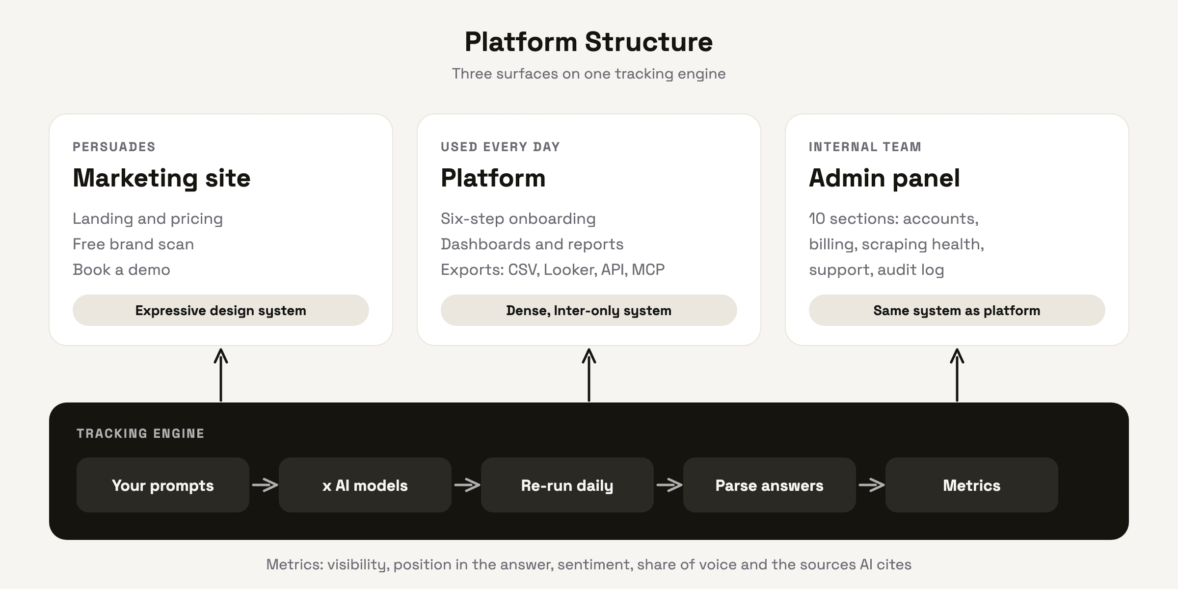
Lanesra is three surfaces on one engine. The engine runs each customer's prompts across AI models every day and turns the answers into numbers. The marketing site sells it, the platform shows it, and the admin panel helps the team keep it running. Each surface got the design system that fits its job.
5. Core Flow
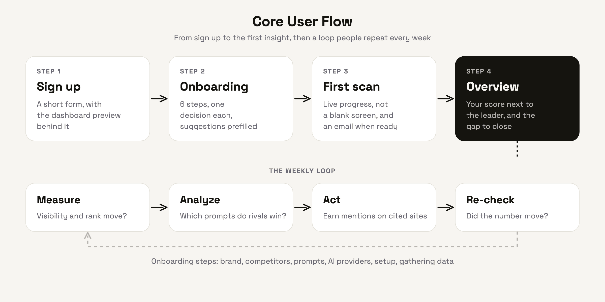
The first session has one goal: seeing your own number next to the leader's. Everything before that moment stays short. Onboarding has six steps, each step asks for one decision, and most answers are already suggested from the brand's domain. The dashboard stays visible behind each step, so people know where they are going.

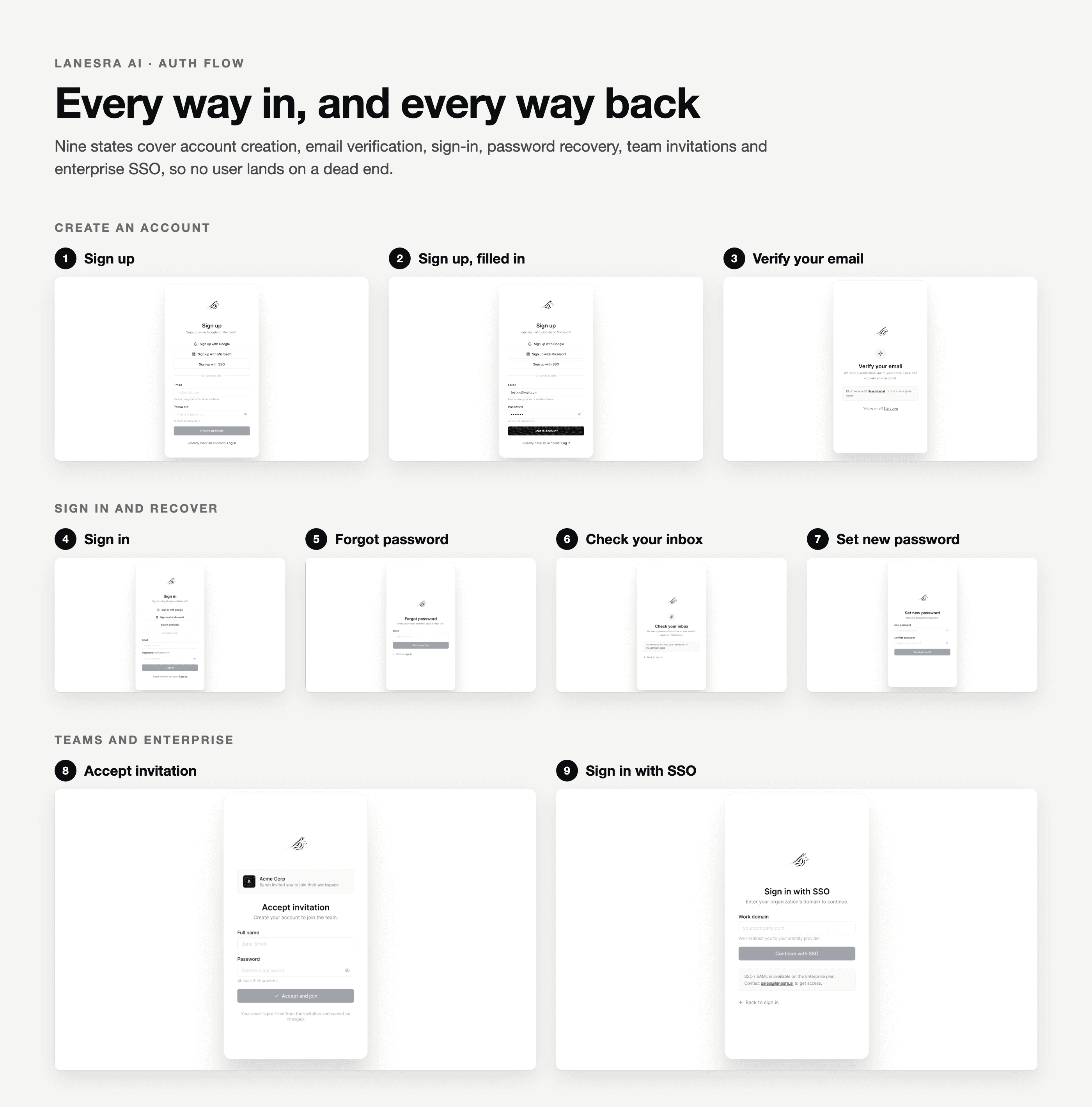
Sign up and log in follow the same idea: a short form, with the product waiting behind it.
6. Wireframes First
With those patterns, I went straight to wireframes: grey boxes, real labels, no colour. I started with sign up and onboarding, then the overview, then worked outward to prompts, mentions, sources and competitors. Every screen got a short written spec for its content, layout and states, including the empty and partial-data states, because data arrives asynchronously and a new account has nothing to show for the first hours.
Keeping colour out at this stage kept the conversation with the client on structure.
7. A Decision That Saved Time: An Open-Source UI Library
Before polishing anything, we agreed to build on open-source libraries instead of drawing and coding every component from scratch: shadcn/ui for the interface parts and Tremor for charts. Both sit on React, Tailwind and Radix, so what I designed could be built by the developers almost one to one.
I used the matching Figma kit to design the whole tool, so tables, forms, modals and navigation came ready. That left my time for the parts a library can't give you: the metric cards, ranked tables and chart styling that make the product feel like itself, plus one rule for charts. In monochrome, series are told apart by line weight and shade, not by colour.

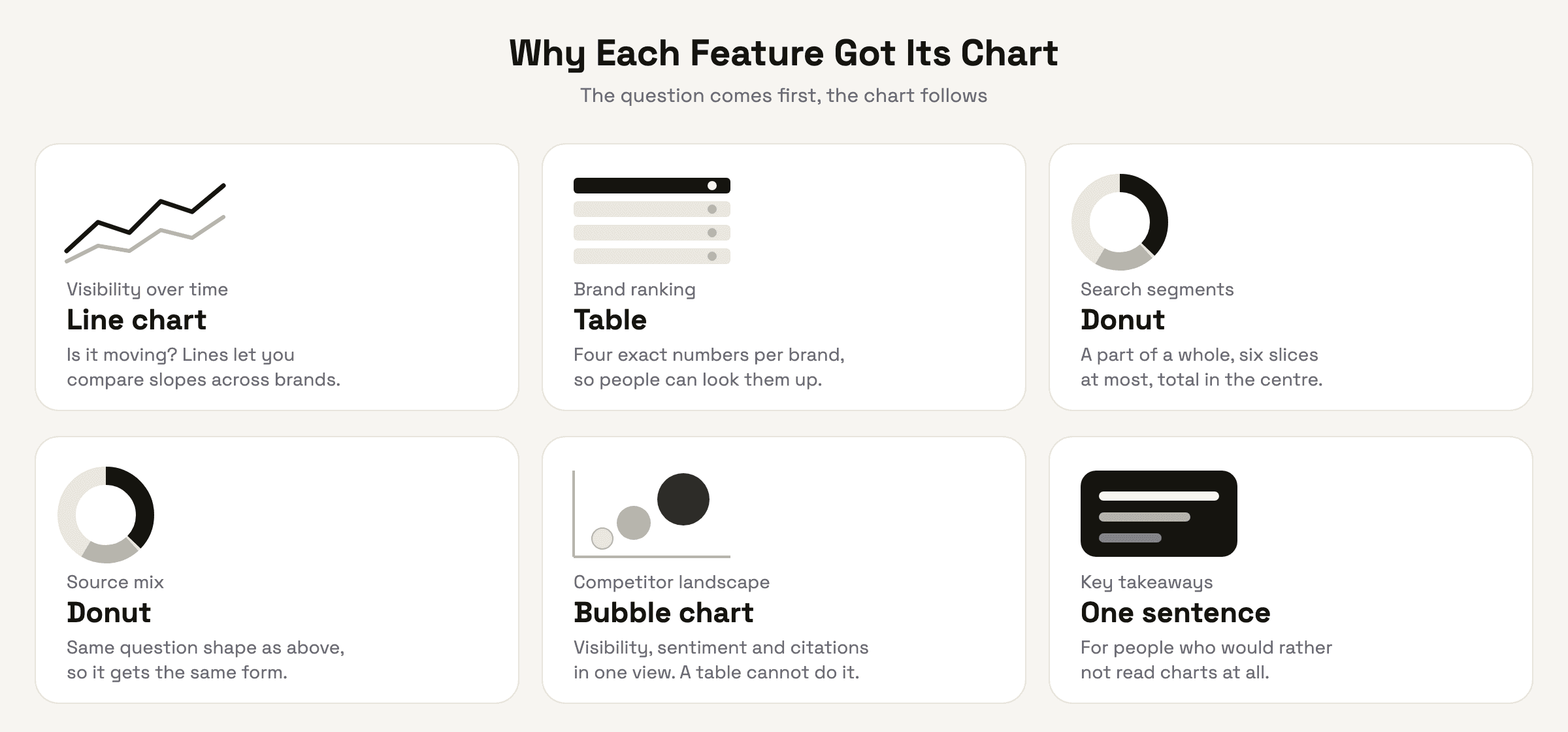
8. Why Each Feature Got Its Chart
This is the part I spent the most time thinking about. A chart is an answer to a question, so I wrote the question first and picked the form second.
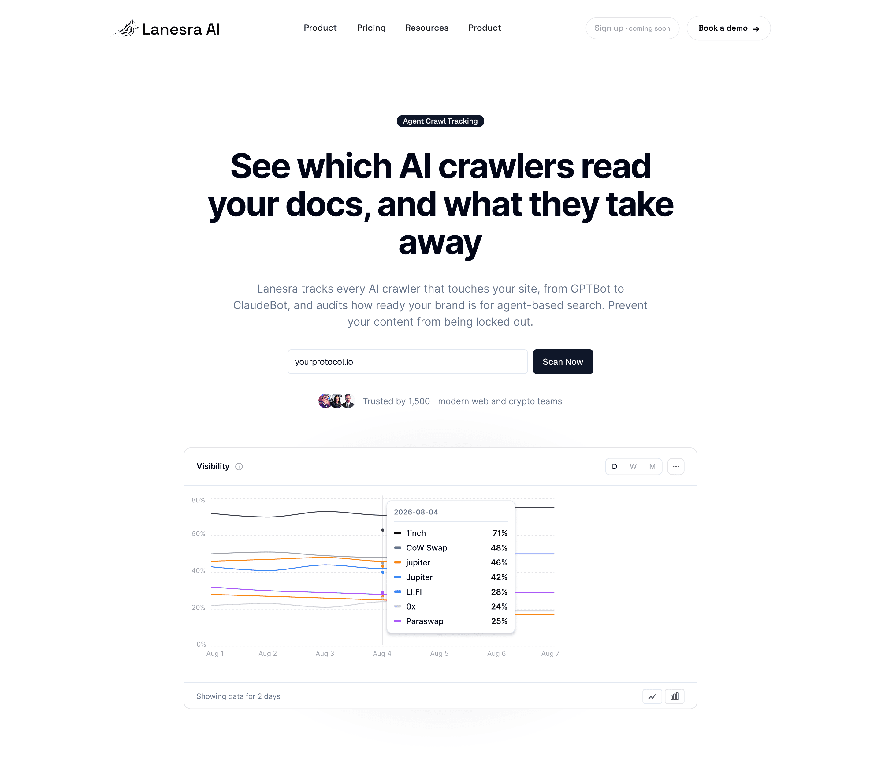
Visibility over time: a line chart. The question is "is it moving?" Lines let you compare slopes across several brands at once, with a day, week and month switch, and an option to flip to bars for people who prefer exact values.
Brand ranking: a table, not a chart. Each brand has four numbers that matter: visibility, share of voice, sentiment and position. People want to read the exact value and compare, so a table with a small status dot for sentiment beats any chart here.
Search segments and source mix: donuts. Both answer a part-of-a-whole question: which intent categories drive visibility, and where AI models find mentions and citations. Few slices, the total in the centre, labels and percentages beside it. They share one form on purpose, so learning to read one means reading both.
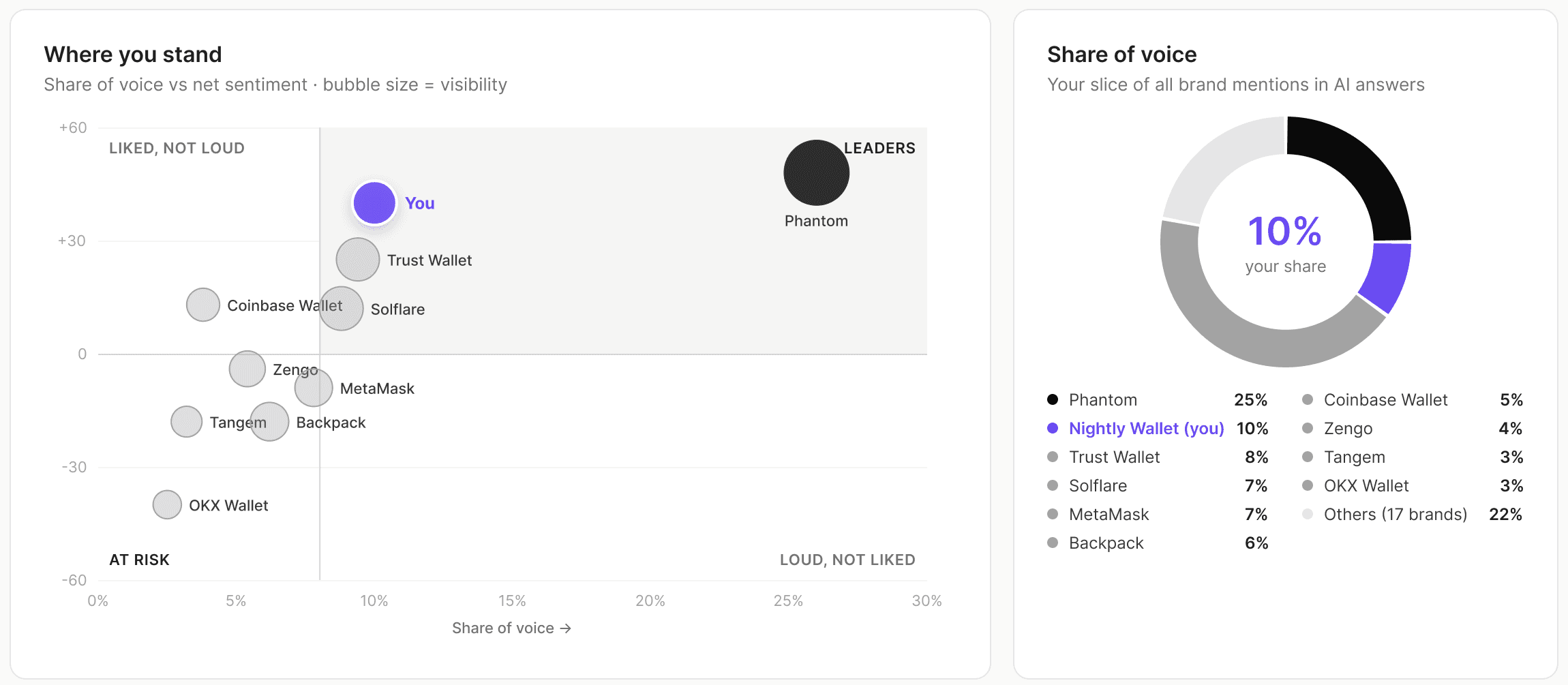
Competitor landscape: a bubble chart. Visibility, sentiment and citation count as bubble size show who is strong but poorly framed, three variables in one view. A table can't show that shape.
Key takeaways: one sentence. Some people never want to read a chart. A plain sentence, such as which brand leads sentiment growth this week, gives them the answer in five seconds.
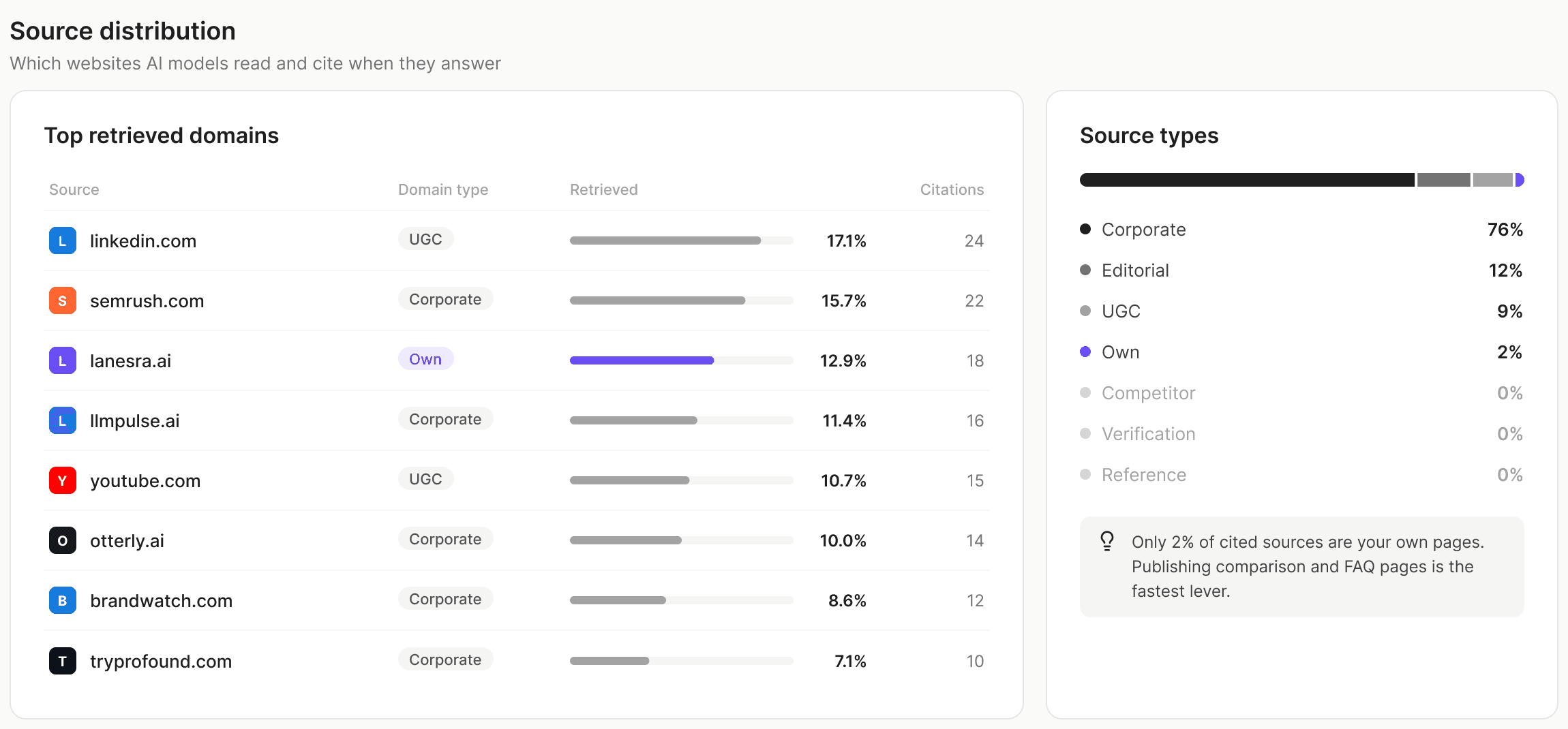
This is how they look in the product. The bubble chart and the donut sit side by side, and the sources table shows which websites AI reads before it answers.
9. What Shipped
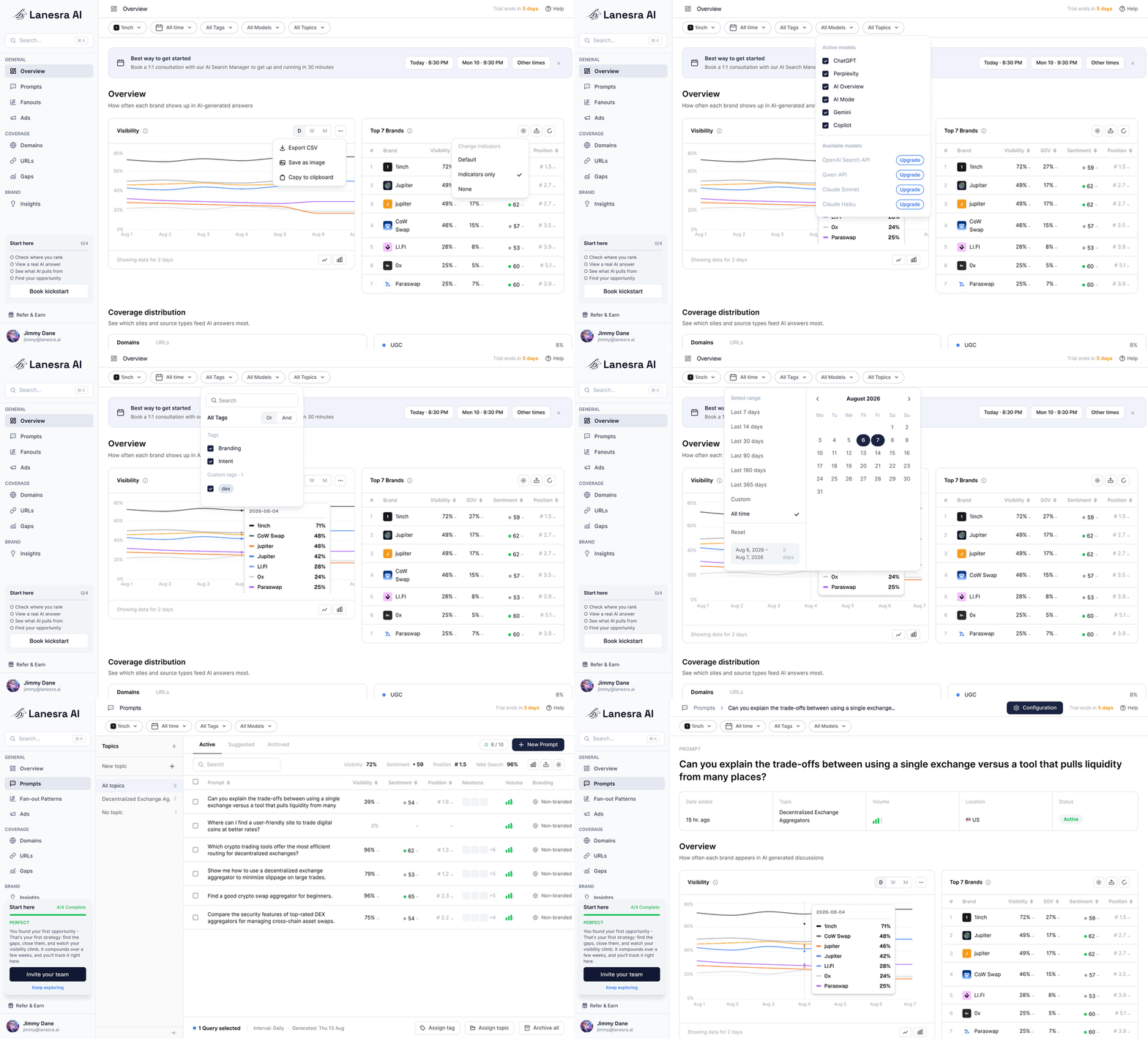
About 50 screens: sign up and log in, a six-step onboarding, the overview, prompts, mentions, domains and links, competition analysis, and brand perception and narrative.
A 10-section internal admin panel for accounts, billing, scraping health, support and more.
The marketing site, and a product that re-runs tracked prompts daily across the main AI models, with exports through CSV, Looker Studio and API.
10. Where AI Helped
A small part. AI turned my written specs into first-draft screens and ran repetitive checks, such as one font, the same sidebar on every screen and design tokens only. The decisions stayed with me: what to ask, what to chart and what to leave out.
11. What I Took From It
The best dashboards start with watching how people already work, then choosing the simplest form that answers their question. A library gets you speed. The reasoning behind each chart is what makes the product useful.