ERP Design System for 100+ Apps - Enterprise UI/UX Design, Part I

Building ERP Design System for +100 Apps - Part I
In the dynamic landscape of digital experiences, a robust design system serves as the compass guiding diverse teams towards a unified vision. It's more than just a repository of UI elements and guidelines; it's a living, breathing entity that evolves alongside the ever-changing needs of users and technology. This case study delves into the journey of creating and nurturing such a system, highlighting its pivotal role in fostering cohesive experiences across products while accommodating growth and adaptation.
From a static to a Dynamic Design System
@Waleed - Principal UX Designer | Strategy & lead
@Emily - UX Designer | Design, manage components & documentation
@Mantu FE Guild | Engineering & implementation
Context at Mantu Group
120+ Apps
With different designs, patterns & flows. No uniformity or consistency.
5 Main Domains
Recruitment
Human resources
Finance
Business (CRM suit)
IT Service
4 Different Frameworks
Bootstrap
Amaris package
Vuetify
Quasar
10K Daily Users
Across different brands & entities
Problems / Pain points
Legacy Foundations
Initially, the project was heavily reliant on old design systems and infrastructures developed by programmers. Notably, designers were not involved in the early phases, which primarily centered around adapting existing technological frameworks.
Inconsistent Design Patterns
Integration of mismatched design patterns from various legacy Enterprise Resource Planning systems, designed and built with no clear alignment, consistency, goals or user input.
Multiple frameworks
A significant challenge in the design process was the use of varied frameworks across the Mantu ERP. Some scopes were built on Bootstrap, others on Vuetify and newer ones utilized Quasar. It was essential to ensure that "Indigo V2" could be implemented seamlessly across these different environments, in order to maintain a unified experience irrespective of the underlying framework.

Limited Capabilities
The current design system's limited components and tokens restrict design flexibility and consistency. There aren't enough tokens to handle all design needs, which affects consistency. The color palette is too small, and more colors are needed for better visuals.
Crafting the system

Building the Design System
Color Palette: Ensuring Brand Consistency and Accessibility
Our color palette is designed to aligned with the Mantu Group branding while ensuring that the relevant accessibility guidelines are respected. Each color is chosen for visual impact and compliance with WCAG 2.1 contrast ratios, guaranteeing legibility and user-friendly interfaces. This thoughtful selection reinforces our brand's identity across all platforms and supports a seamless user experience
Adoption of Atomic Design Methodologies
Using Atomic Design proven principles to structure and build a comprehensive design library within Figma.
Efficient Dark Mode Implementation
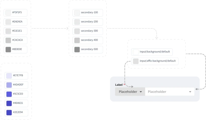
Using atomic design principles and color variables, our design system simplifies the implementation of dark mode. Designers can instantly switch interfaces to a dark theme, enhancing usability in low-light conditions and accelerating the design workflow.
Building Dark Mode
Dark Mode Color Palette
Develop a dedicated color palette specifically for dark mode that maintains brand color consistency and meets accessibility standards.
Ensure each color is tested within the real product UI to confirm visual effectiveness and usability in dark mode settings.
Variables for Dark Mode
Utilize the 'mode' feature in Figma to establish and manage color variables tailored for dark mode. This allows for seamless switching and integration within the design environment.
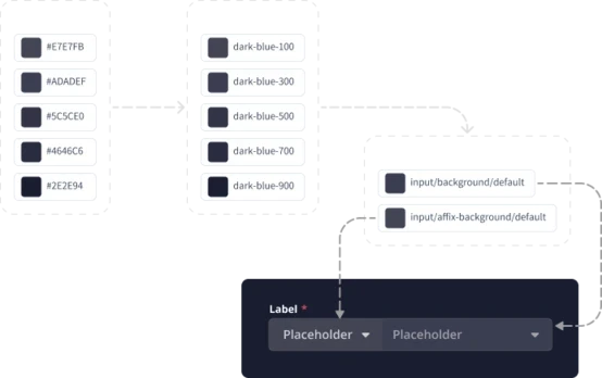
Dual Mode Color Variables for Components
Design each component to have predefined color variables for both light and dark modes. This ensures components automatically adapt to the selected theme without requiring manual adjustments, streamlining the design process and enhancing user experience across different settings.
Conclusion
By addressing legacy challenges and implementing a dynamic design system, Mantu Group has laid the foundation for a cohesive and adaptable user experience. This transformation not only enhances design consistency but also streamlines processes across diverse frameworks. The journey underscores the importance of evolving design systems to meet the ever-changing needs of users and technology.
In Part II, we will delve deeper into the implementation strategies, icon management, and the reusable layout of the design system to further enhance Mantu Group's digital landscape.