Mantu Recruitment Platform - ERP SaaS & UX UI Dashboard Design

Breaking the "15-Tab Nightmare": Consolidating Recruitment Ecosystem
The Context: When Complexity Becomes a Wall
Imagine you are a new recruiter starting your first day at a large firm like Amaris. Instead of a warm welcome and a simple tool, you are handed a list of 15 different URLs.
To hire just one person, you have to jump between Tab 1 to post a job, Tab 2 to screen a resume, and Tab 3 to check an interview schedule, all the way to Tab 15. Each app looks different, works differently, and requires a separate login.
As a Product Designer with 5 years of experience specializing in ERP integrations and design systems, I knew this wasn't just a "visual" problem. It was a productivity crisis. My goal was simple: to make a system that doesn't just look good but "makes sense and serves a purpose"
The Problem: The "Spider Web" of Chaos
The fragmented system created a massive cognitive load for our users. Recruiters spent more time "managing software" than actually "hiring people."
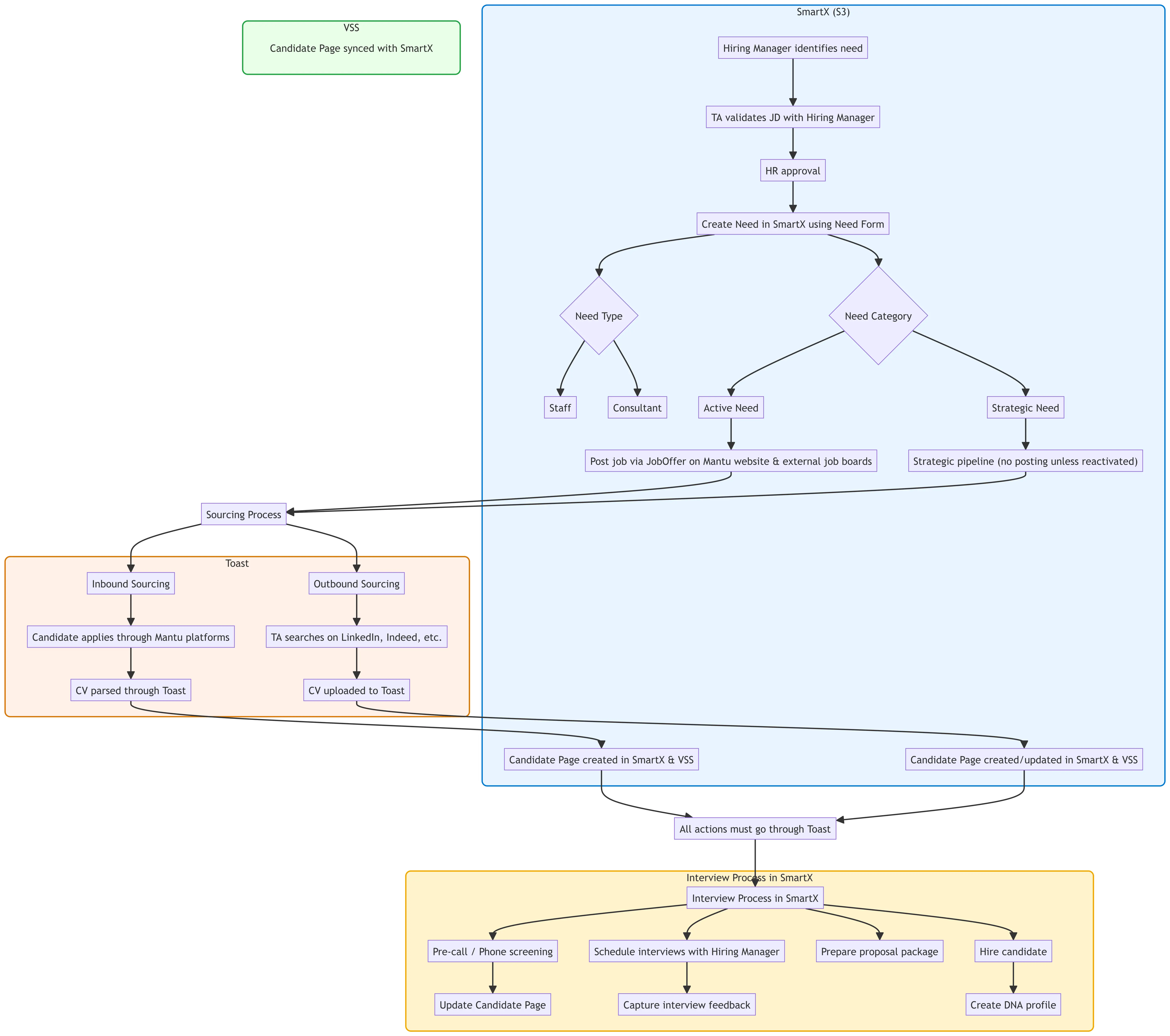
Emotional Toll: Users felt drained and overwhelmed by the constant "context switching."
Training Hurdle: New employees couldn't work alone. They needed a dedicated mentor just to help them remember which app did what.
Technical Debt: Data was scattered everywhere, making it impossible to have a "Single Source of Truth."
The Strategy: A 2-Year "Marathon" of Cleanup
Building on my background of creating Design Systems for over 100 ERP apps, I didn't want to just put a "pretty coat of paint" over a broken system. We needed a deep, strategic change.
Step 1: Deep Discovery: I spent months observing how recruiters and business managers actually worked.
Step 2: Backend Alignment: I worked closely with developers to clean up the "messy" backend so that all 15 apps could finally "talk" to each other [Context].
Step 3: Unified Design: I applied a consistent Design System to ensure that every new module felt like part of the same family.
The Solution: One Hub, One Flow
The result was a unified recruitment domain where all 15+ functions lived under one roof. We focused on a centralized dashboard and a unified notification system that brought the work to the user, rather than making the user go find the work.

The Impact: Real Feedback from the Field
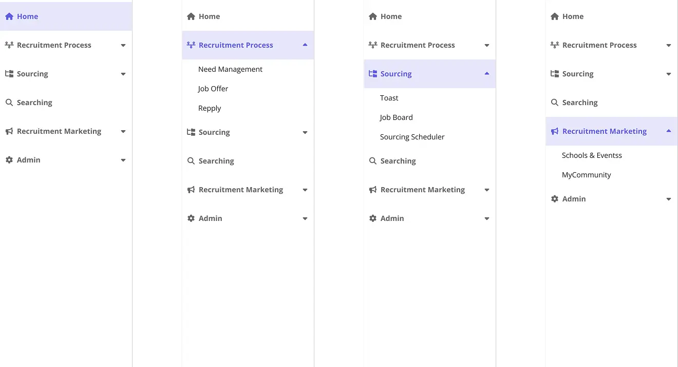
The design is now moving into the implementation phase, and the feedback from our pilot users has been incredible:
No More URL Hunting: "I don't have to remember 15 different links anymore. Everything is just there."
The "One-Tab" Life: Users went from opening 15+ tabs every morning to just one. This drastically reduced their daily stress.
Instant Onboarding: The most rewarding feedback? New hires can now start using the system immediately without a mentor. The interface is so intuitive that the "learning curve" has practically disappeared.
The Reality Check: Balancing Vision with Implementation
A major takeaway from this project was learning that a "perfect" design is only as good as its implementation. While our "North Star" was to have all 15+ apps integrated into a single, seamless Single Page Application (SPA), we had to face a common reality: limited developer resources
We couldn't flip a switch and change everything overnight. Instead, we adopted a phased approach using Sprints.
To make this work, I had to design "Bridge Experiences", temporary transition designs that guided users from their old, familiar apps into the new modules, one by one. This ensured that:
Users weren't overwhelmed by too much change at once.
The dev team could focus on high-quality delivery for each sprint.
The transition felt natural, allowing users to adopt the new system at a manageable pace.
This taught me that as a Senior Designer, my job isn't just to design the "final destination," but to design the journey so that users, stakeholders, and developers all move forward together without getting lost. It’s about making sure the transition "makes sense and serves a purpose" every step of the way