Infinity Core - Employee Empowerment Mobile App & UI/UX Design
Building Employee Empowerment App
The Challenge
KPMG wanted an app to make their employees feel valued, motivated, and empowered. The goal? Create something fun and easy to use that fits into their workday, with a bright, cheerful vibe as hinted in the initial proposal.
Step 1: Getting to Know the Users
I started by figuring out what KPMG employees needed. I sent out surveys and chatted with folks from analysts to partners to hear about their daily grind, what fires them up, and what bums them out. I also peeked at their work environment to see where an app could help. Plus, I checked out apps like Workday to spot what works (and what doesn’t).
Key Findings:
Employees love recognition and clear career paths.
They’re frustrated by vague feedback and limited growth visibility.
Most prefer mobile apps for quick check-ins.
Step 2: Setting the Goal
The app had to do three things: make employees feel empowered, keep them motivated, and be super easy to use. We aimed for 80% of employees using it regularly within six months.
Step 3: Mapping the User Flow
I sketched out how employees would use the app, keeping it simple:
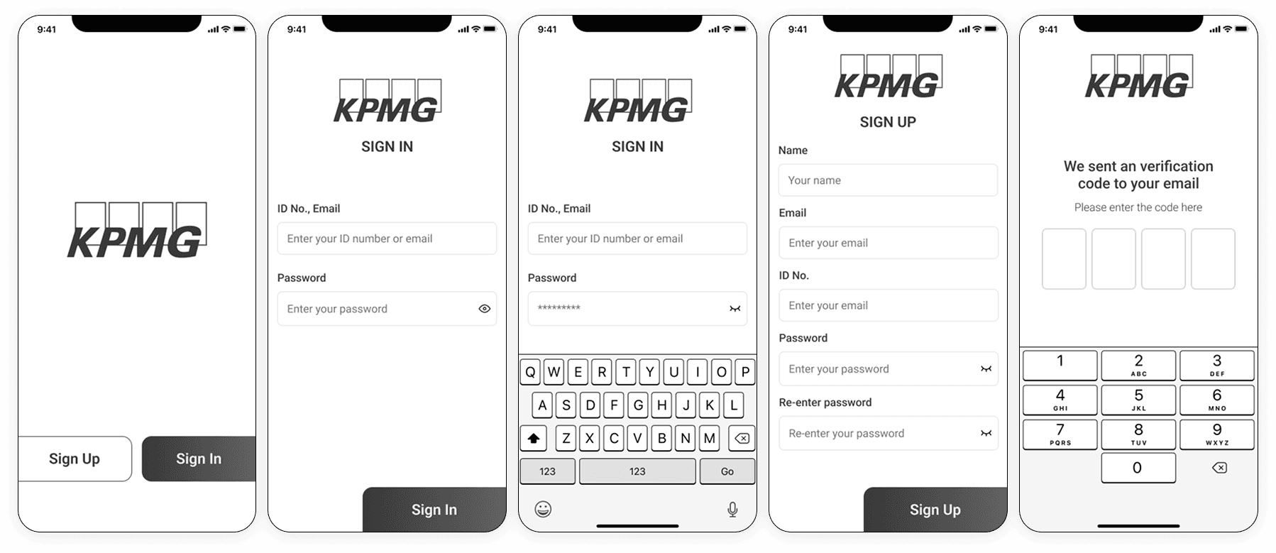
Sign Up: Log in with KPMG credentials, set up a quick profile.
Home Base: A dashboard with tasks, goals, and shout-outs.
Set Goals: Pick short- or long-term goals tied to job metrics.
Get Rewards: Earn badges for crushing it, see team leaderboards.
Learn Stuff: Access short training videos for skill boosts.
Give Feedback: Share thoughts with managers or teammates.
Tweak Settings: Update profile or notifications.
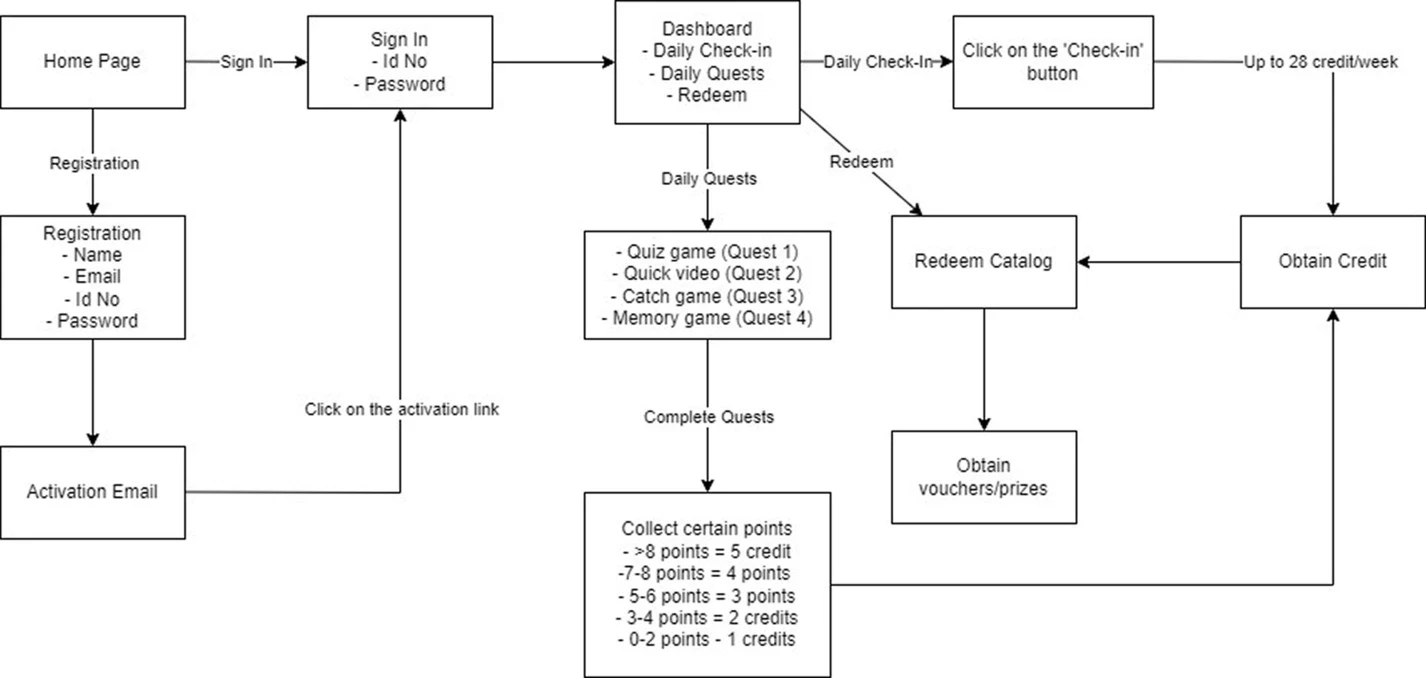
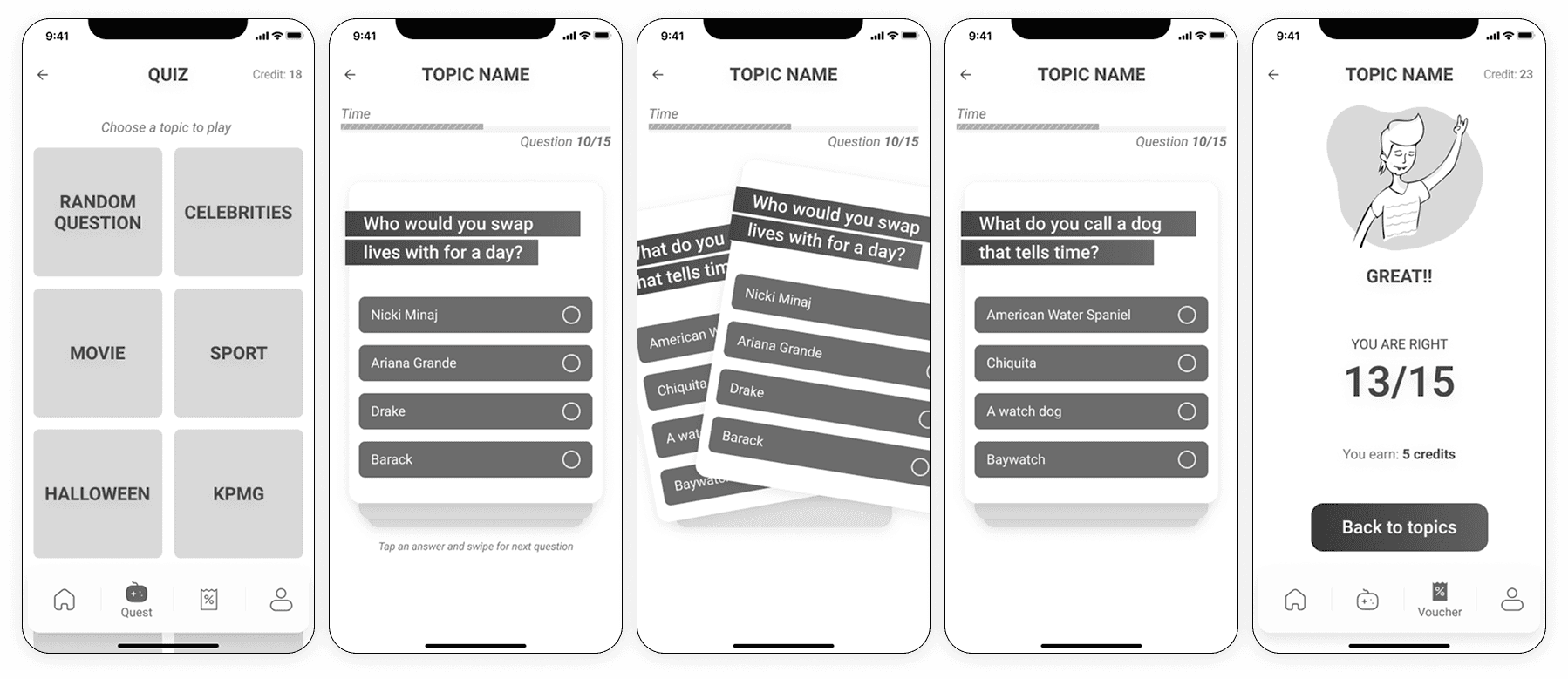
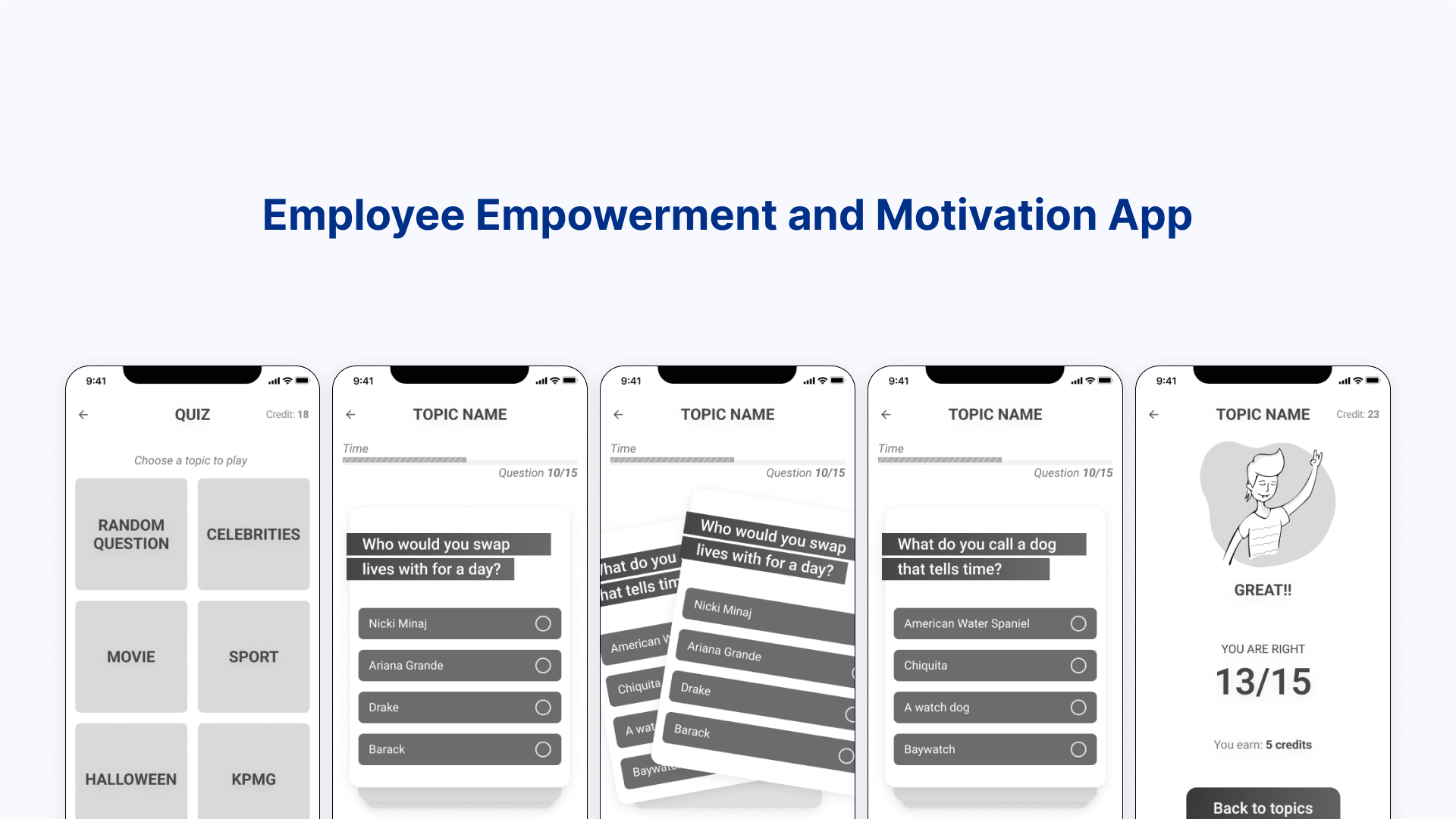
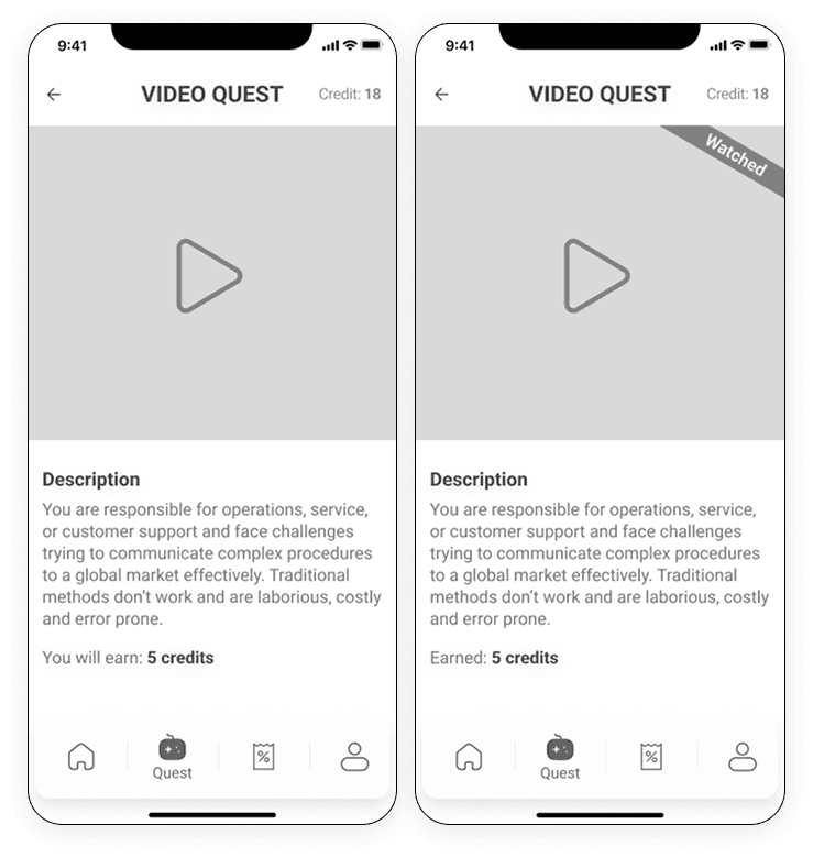
I made wireframes to show this flow, focusing on a clean, bright look.
Step 4: Crafting the Concept
The app’s big idea was to feel like a personal cheerleader. It’d help employees track goals, celebrate wins, and grow skills. Features included:
A custom dashboard for each user.
Fun badges and leaderboards to spark excitement.
A career path tool showing what’s needed for the next step.
Quick training modules for on-the-go learning.
A feedback hub for easy communication.

The design had to be clear, engaging, and accessible, with a bright color scheme (think blues and yellows) to keep things lively.
Step 5: Teamwork with Designers and Devs
I worked with an artist to turn wireframes into vibrant mockups. We picked a bold color palette and clean fonts (like Open Sans) to nail the bright theme. They built a clickable prototype in Figma for testing.
With the developers, we chose React for the web and React Native for mobile to keep things smooth across devices. They hooked the app up to HR systems for seamless data and made sure it loaded fast.
Takeaways
I’d love to dive deeper into user testing and see the product come to life after the wireframe stage. As a UX designer on this project with limited resources, I wasn’t fully looped in on what happened to the product once I handed off the wireframes.